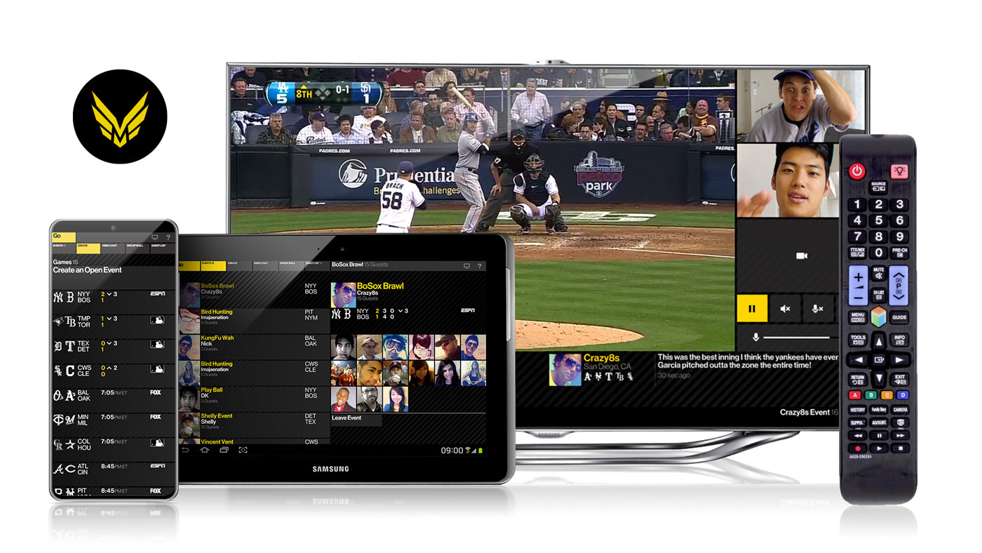
Evolution of LIVE Sports
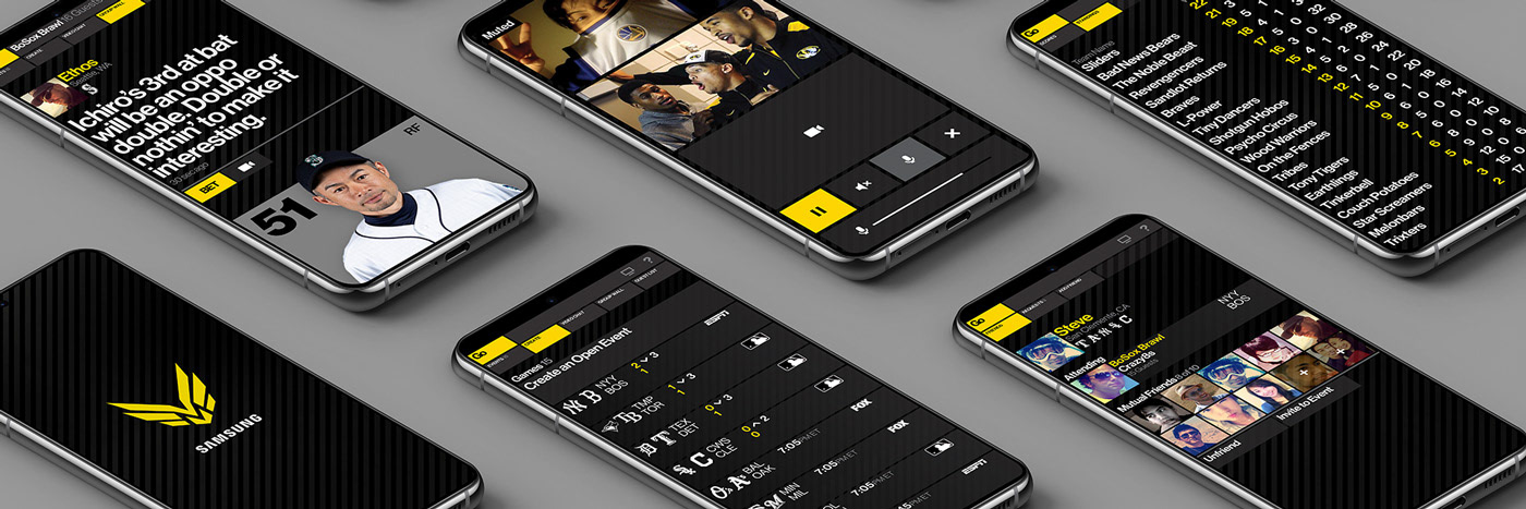
The Samsung Smart TV introduces the world's first interactive LIVE sports experience across devices, highlighting the next generation of devices and input innovations. An influential prelude to the Apple TV+ Friday Night Baseball experience.
We were tasked with building a comprehensive live demonstration of the experience across devices. The feat was a 1 month, knockdown, drag-out marathon of storyboarding, brand language, sound design, user experience modeling, product video creation, and interactive software development–capped with a formal spec doc and style guide to build from.
Client: Samsung User Experience Center
Sector: Consumer Electronics
Discipline: Product Experience
Creative Direction: Dane Storrusten
Art Direction / Design: Dane Storrusten
Software Development Contributors: InterKnowlogy

Compliments to the Experience
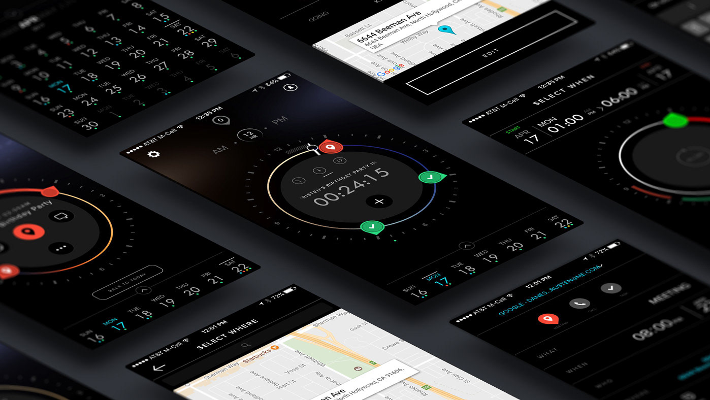
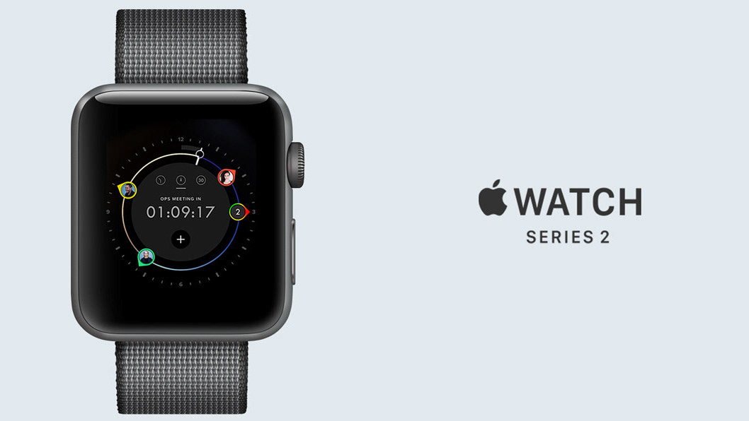
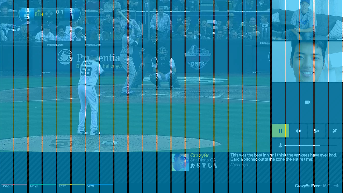
Simplicity and clarity were paramount tenets in a an adaptive system that enveloped an existing live broadcast.
We approached a designed system that strived to position the main event as the focus by being formidable sidekick rather than the hero.
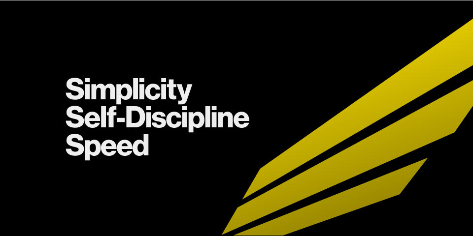
SIMPLICITY
CLARITY
READABILITY


Quick with the Swiss-ness
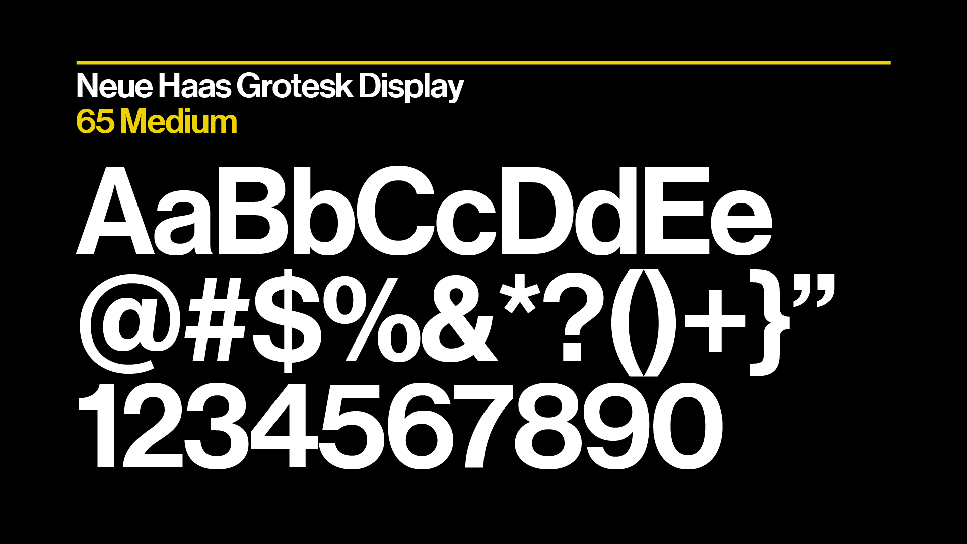
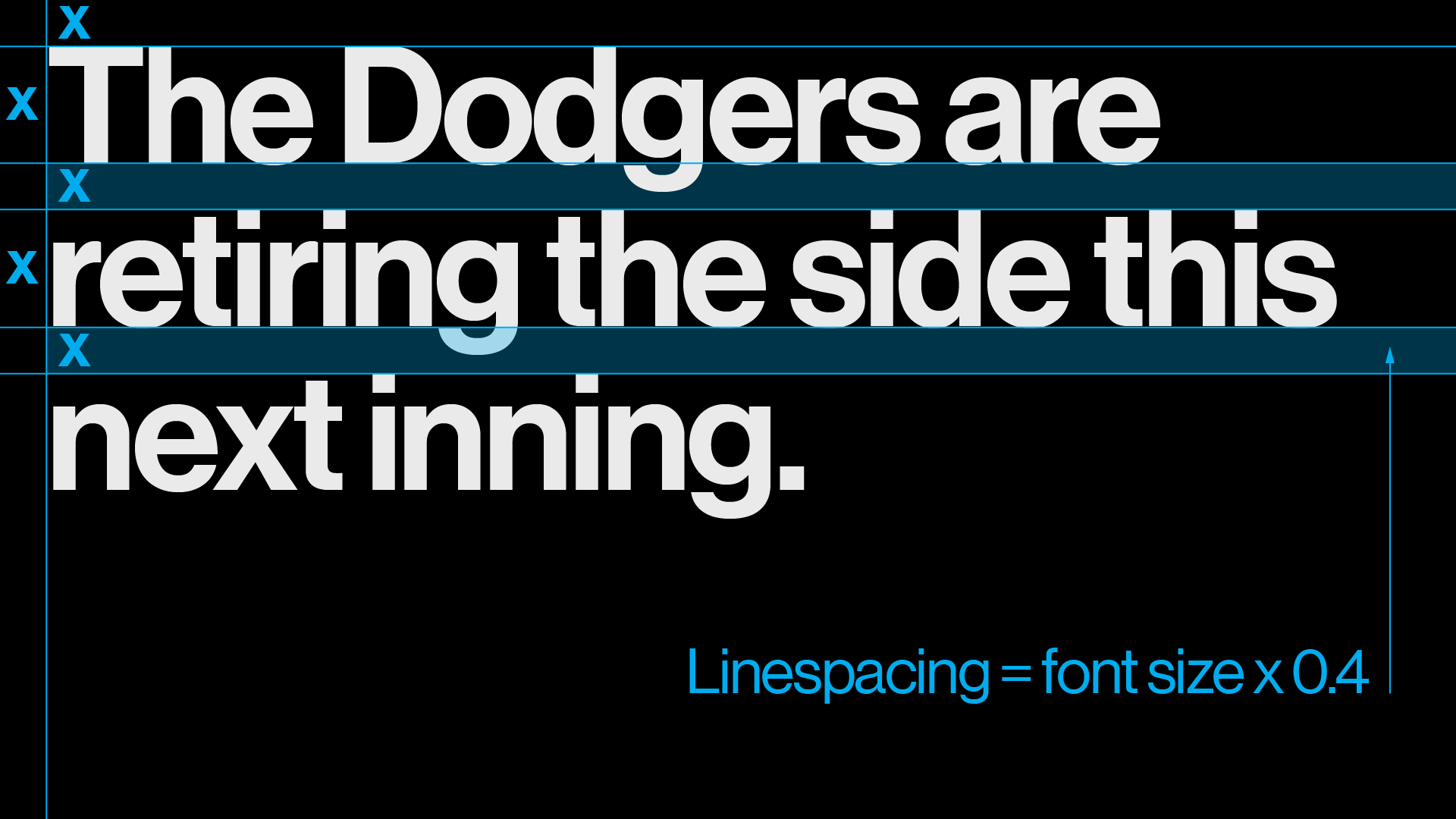
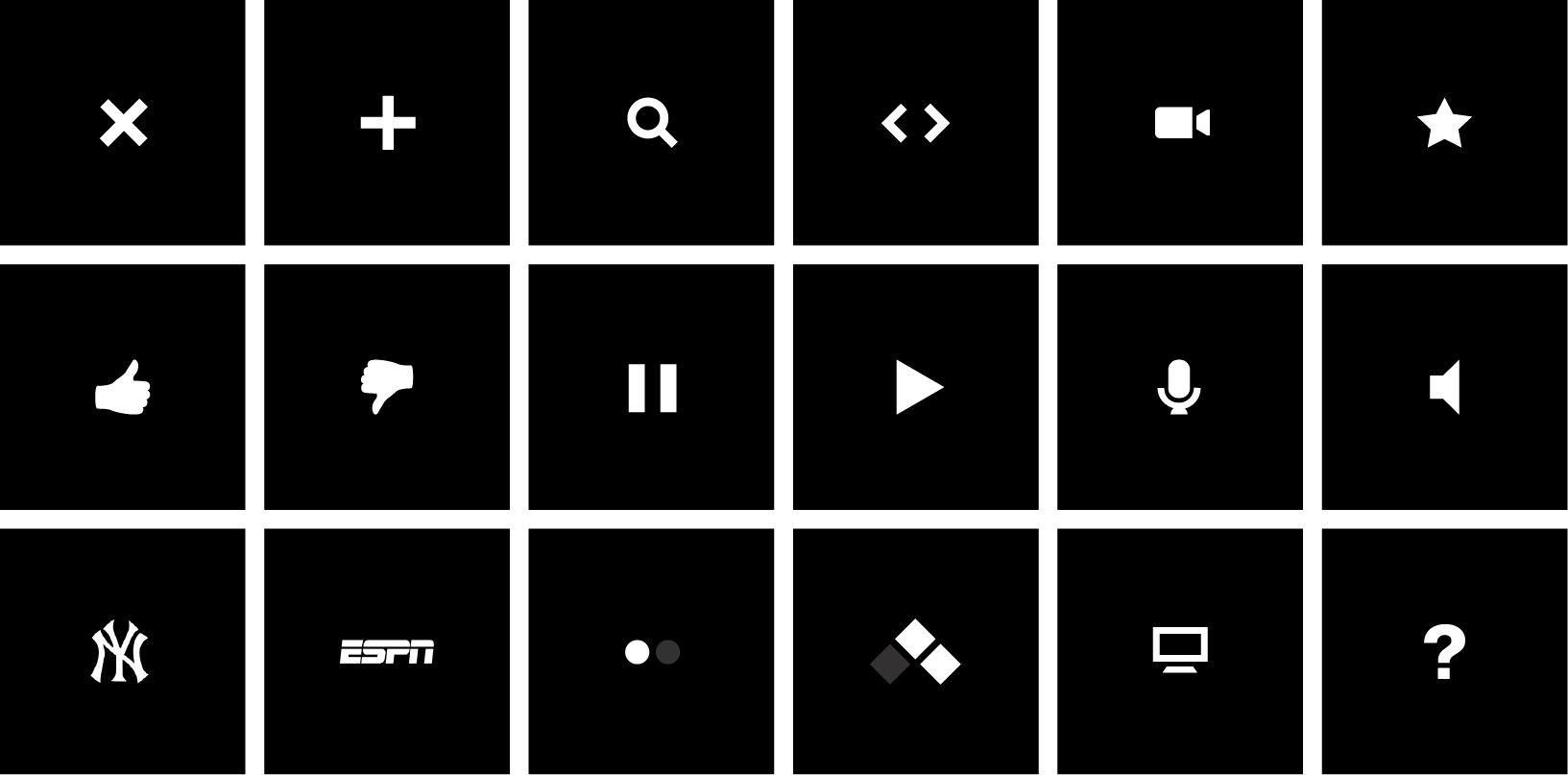
We employed with a swiss-inspired design & motion language rooted in a bold colorway, quick and performant transitions, thoughtful typography, minimalist iconography, and rigid grid systems throughout.

Making it Real.
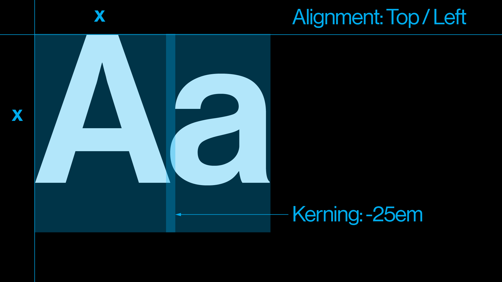
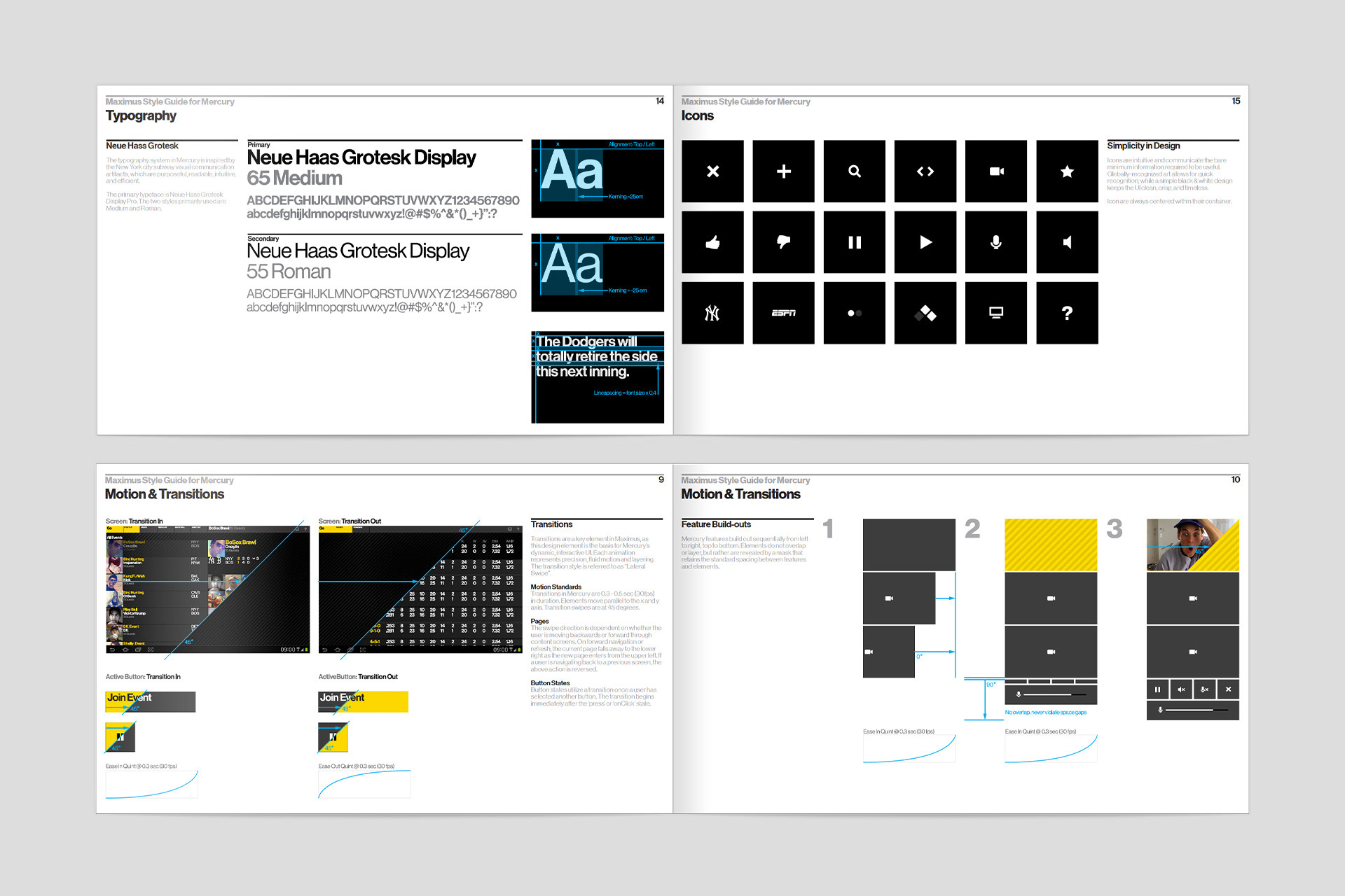
Design & prototyping is one thing. Executing a usable, error-free product with engineers across multiple platforms, another. Every dimensional user experience comes with the necessity of adequate design communication to our fellow engineering teams. We approached our design specifications with the same passion and attention as the creative process leading up to it.
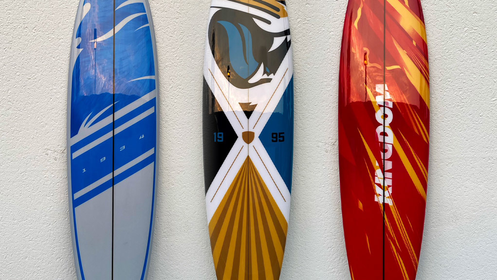
The Executive Gift
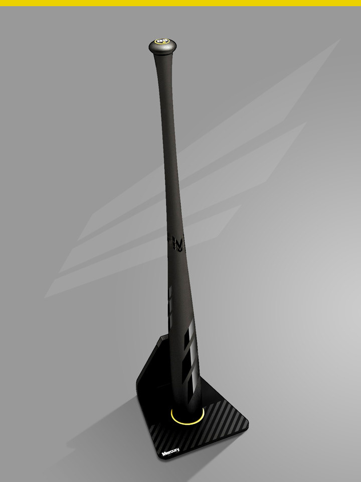
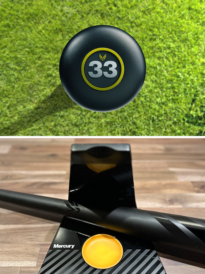
No pivotal initiative should be delivered without a gift. Since MLB was the cornerstone of the LIVE sports experience, we wanted to create more than a glorified paper weight... something you could hold, and feel.
Each was equipped with a custom paint scheme, the same thoughtful branding as the software experience, and equipped a beautifully crafted acrylic stand–making its overall presence a statement in of itself.