The Next Era of Chargers Football
The evolution of a storied NFL franchise–arguably one of the most recognizable identities in sports–moving from one SoCal home to another... and they weren't alone.
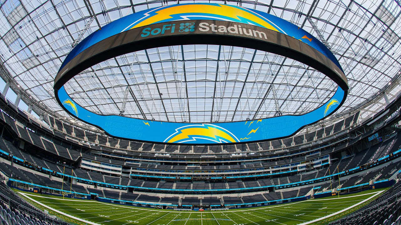
Client: Los Angeles Chargers
Sector: Sports
Discipline: Brand Identity
Creative Direction: Mollie Wilkie
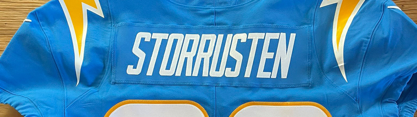
Art Direction / Design: Dane Storrusten, Michael Irwin
Uniform Design: Nike
Media Design Contributors: LA Chargers Creative
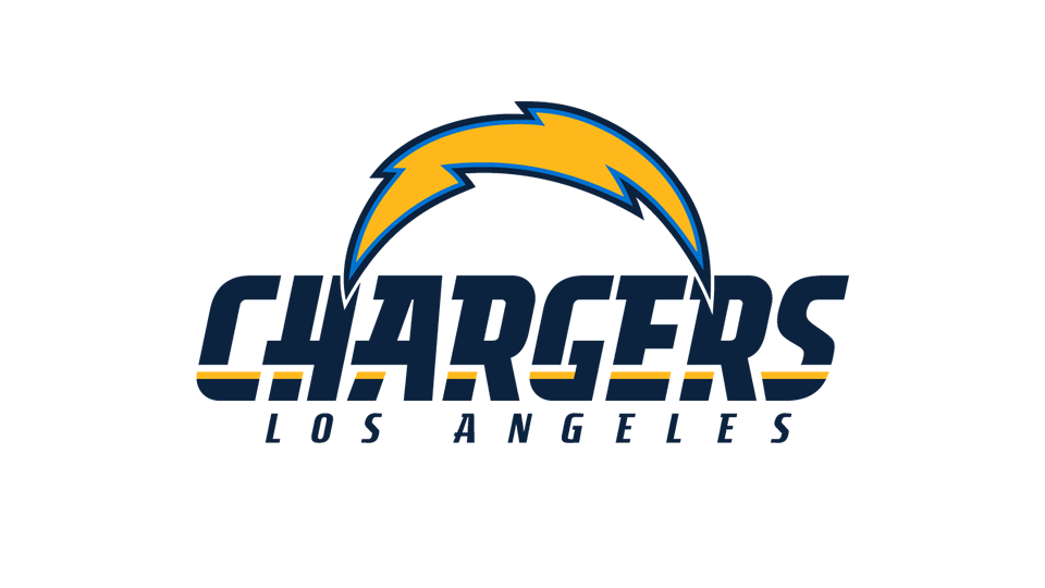
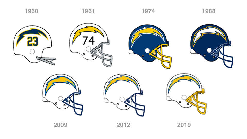

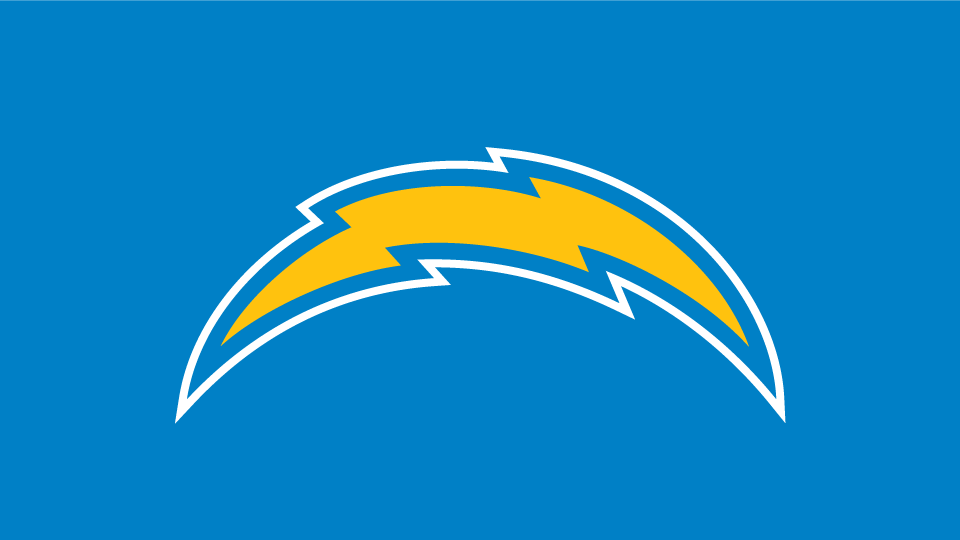
One Bolt to Rule Them All.
Reinventing the Chargers wasn't about dramatic change. Take what's working, the incredible equity, and make it stronger–and more importantly–responsive to the modern media landscape.
Remove extra keylines for a bolder read at small scale.
Streamline the shape so it has more movement/speed.
Enhance the geometry for better symmetry.


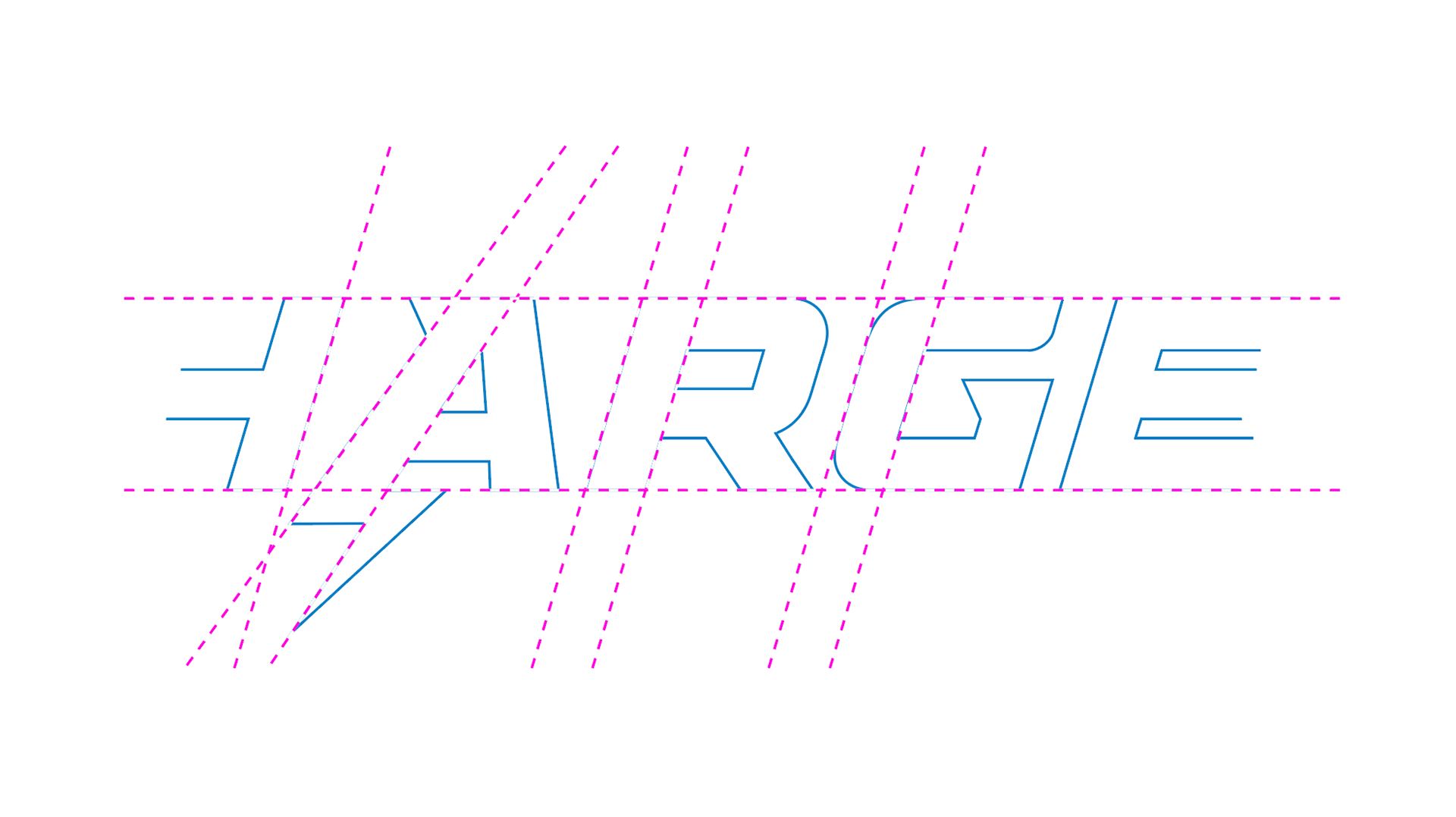
A Typeface Built for the Future
The Chargers previous wordmark oozed brand equity. However, it was marquis reminder of the San Diego era of the club. A new custom wordmark would add a burst of new energy to the identity, and perhaps take pressure off the Primary Mark to do all the heavy lifting. The wordmark quickly evolved into a full alphabet as the Chargers' creative & social teams introduced clever messaging campaigns. And the Bolt emoji becomes a supporting character throughout the system.


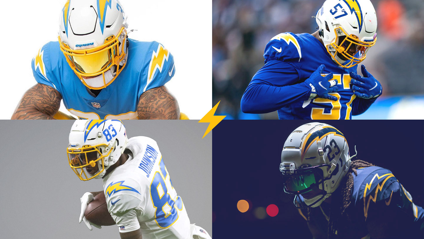
Uniform System
The Chargers have the crown for the most versatile uniform closet in the NFL, and have set the tone for other clubs to broaden their fashionability.
At the core hangs a strong home/away ensemble–rooted in White and Power Blue with interchangeable pant (White and Gold). Then, to extend the closet, a Royal Blue Color Rush with a progressive nod to an all-Navy alternate.