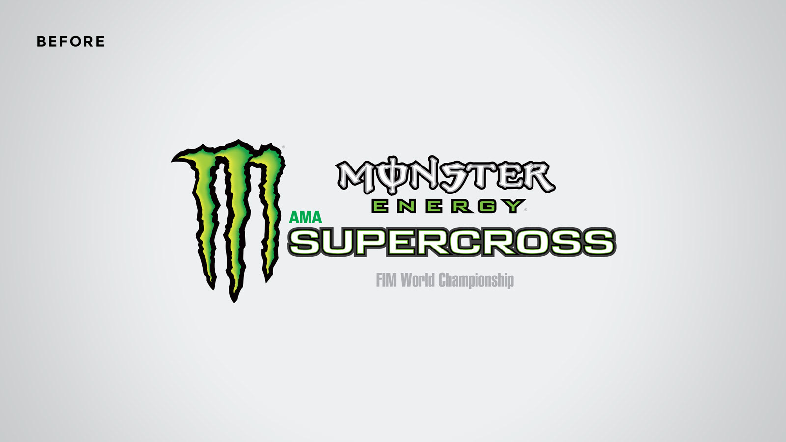
A Monster Rebrand
The Super Bowl of Motocross gets a fresh new look that celebrates the diversity, tenacity, and showmanship of it's athletes and fans.
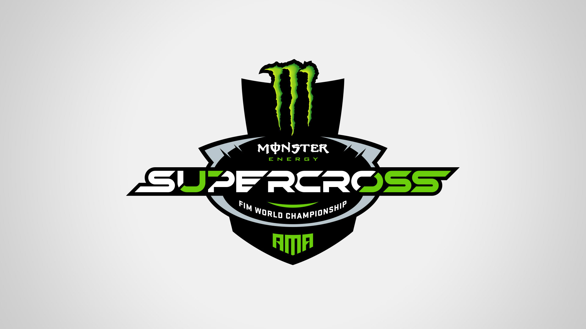
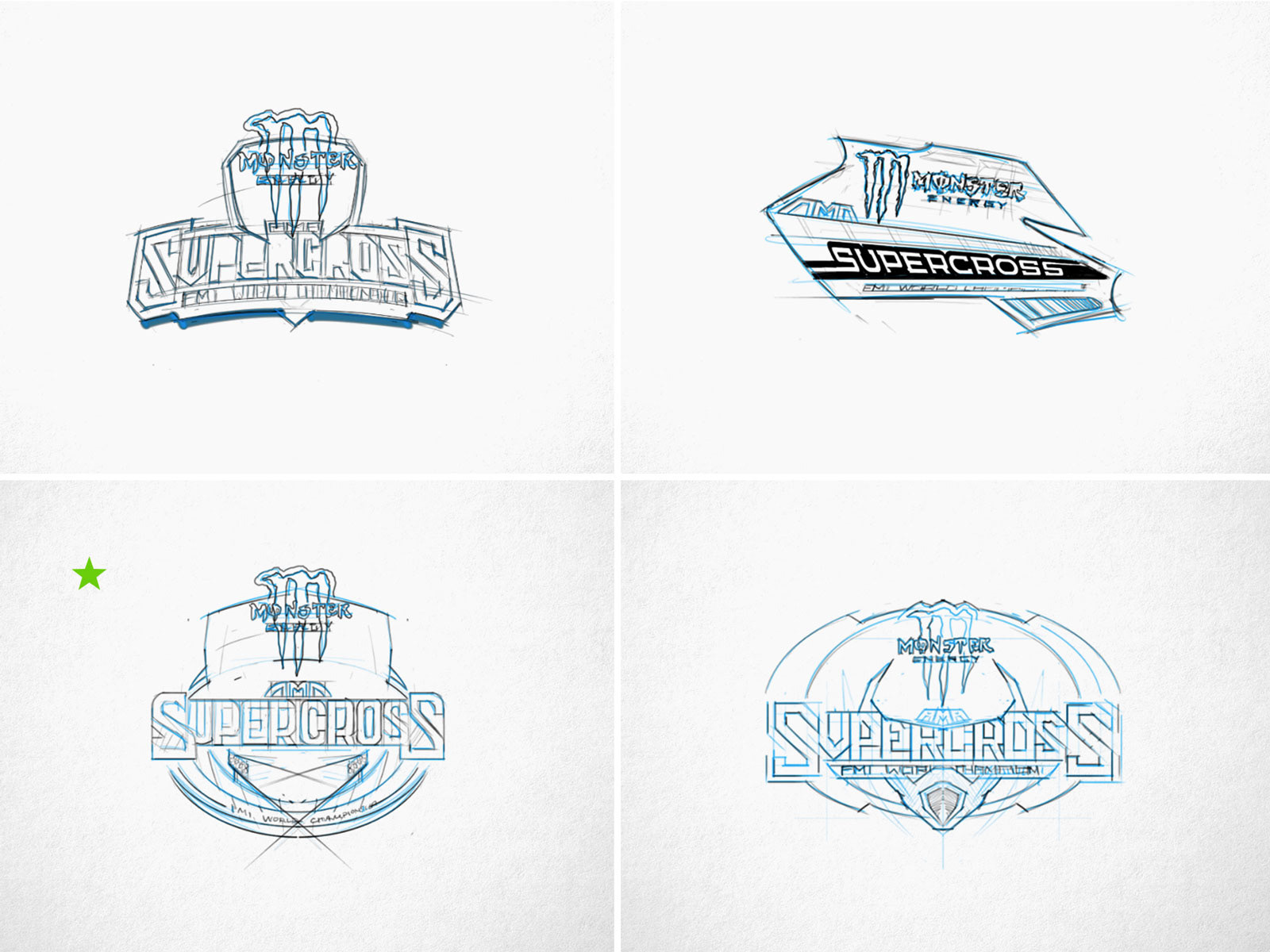
Gridiron Labs worked with the Feld Entertainment design team to lead a broad creative exploration on a new logotype that can live within the construct of a title sponsored mega-event. The rebrand proved to be an exercise in hierarchy. How do we lead with a sponsor and create a memorable identity for the event, and ultimately the entire sport in one single logo? Below you'll see the process and some concept development work that lead to a final outcome and launch for Monster Energy AMA Supercross.
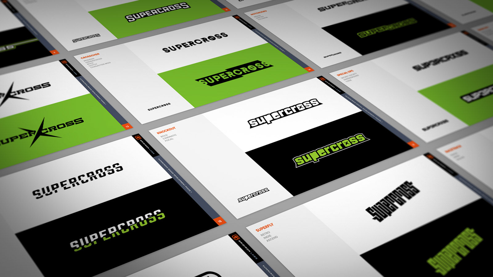
The Process
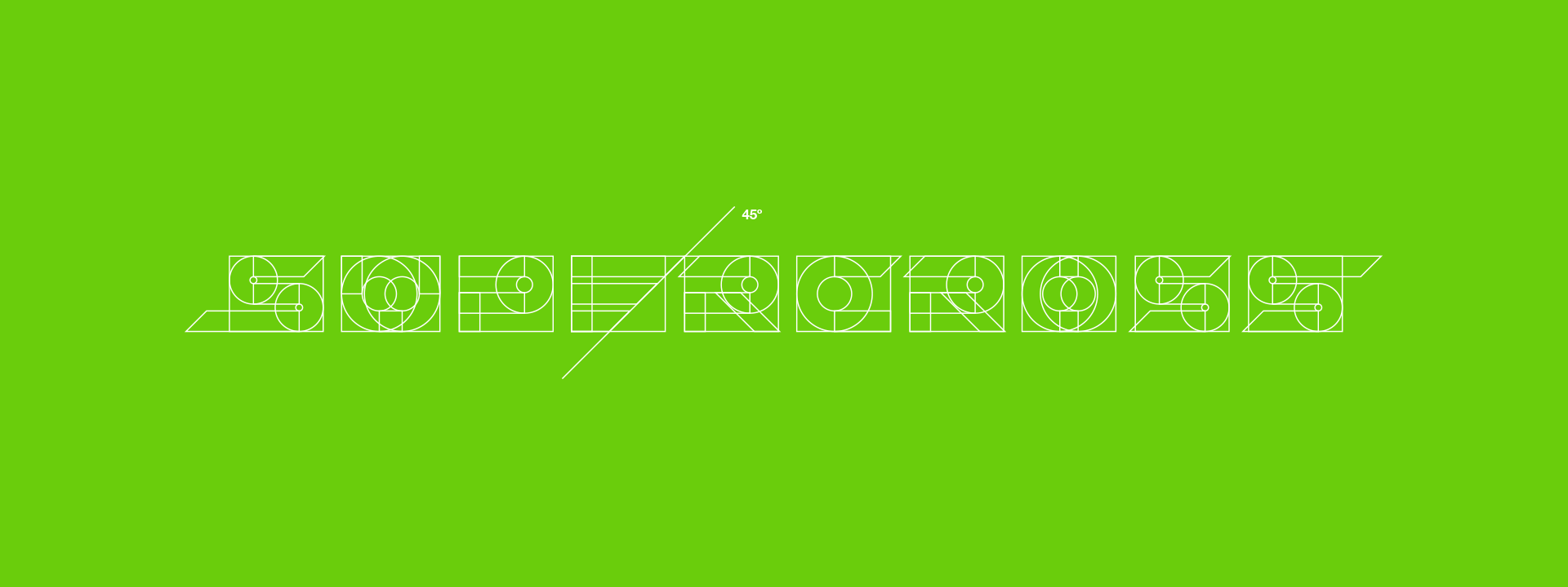
With Supercross, we left no rock unturned. 50+ design explorations ranged from retro to underground to futuristic...
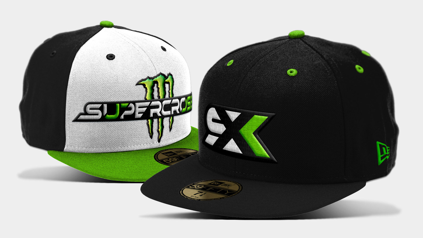
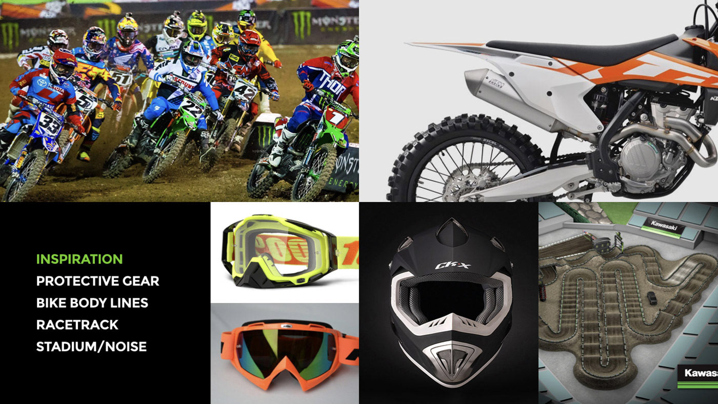
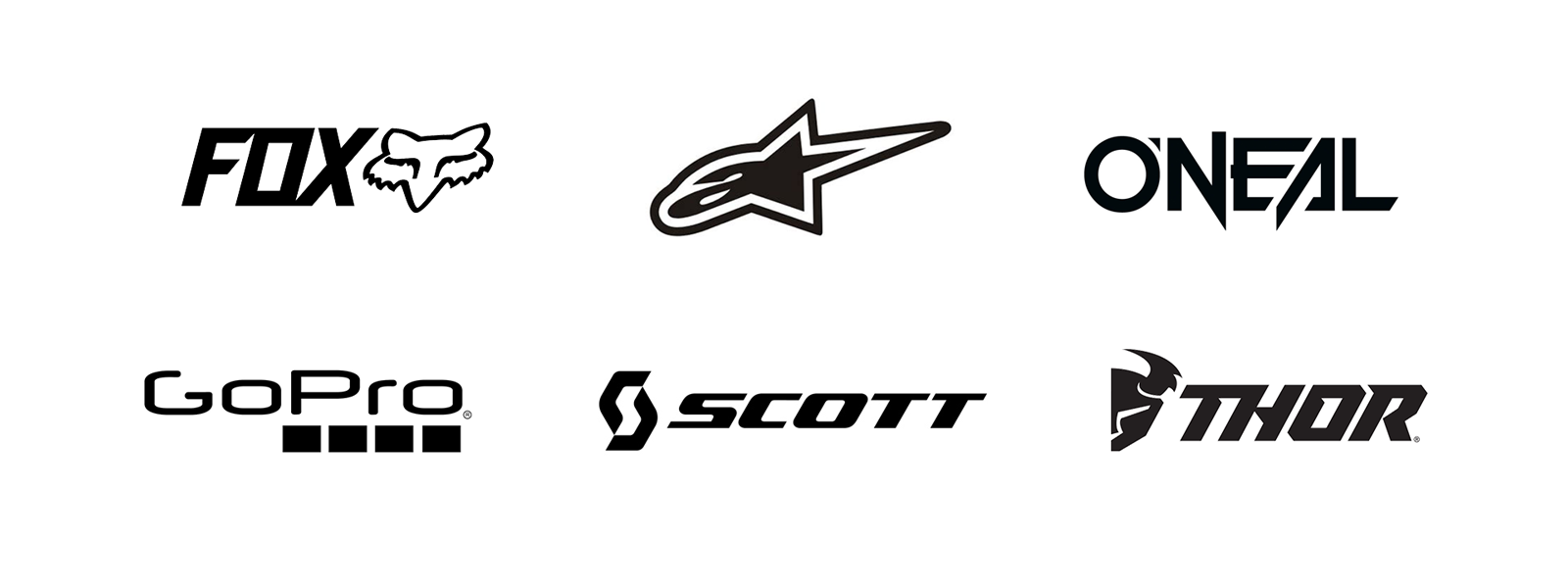
The development process started by looking within the action sports industry–finding brands that exemplify the culture of fearless, hyper-fueled, high-flying athletes that hang their hat on loyalty. At the end of the day, the lens ends up being that of an apparel brand. Would riders buy it if it was on a cap, hoodie or T-shirt?
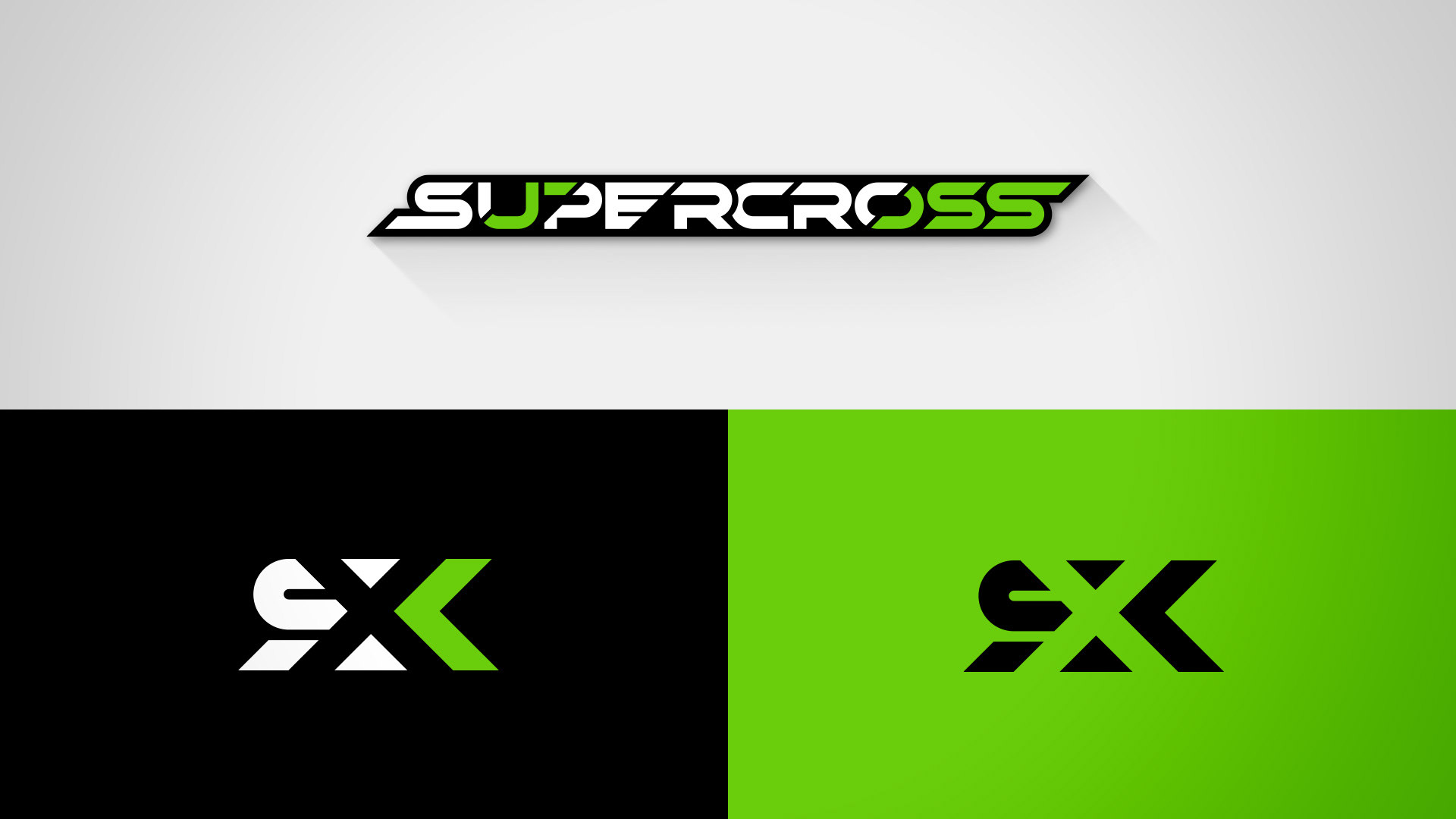
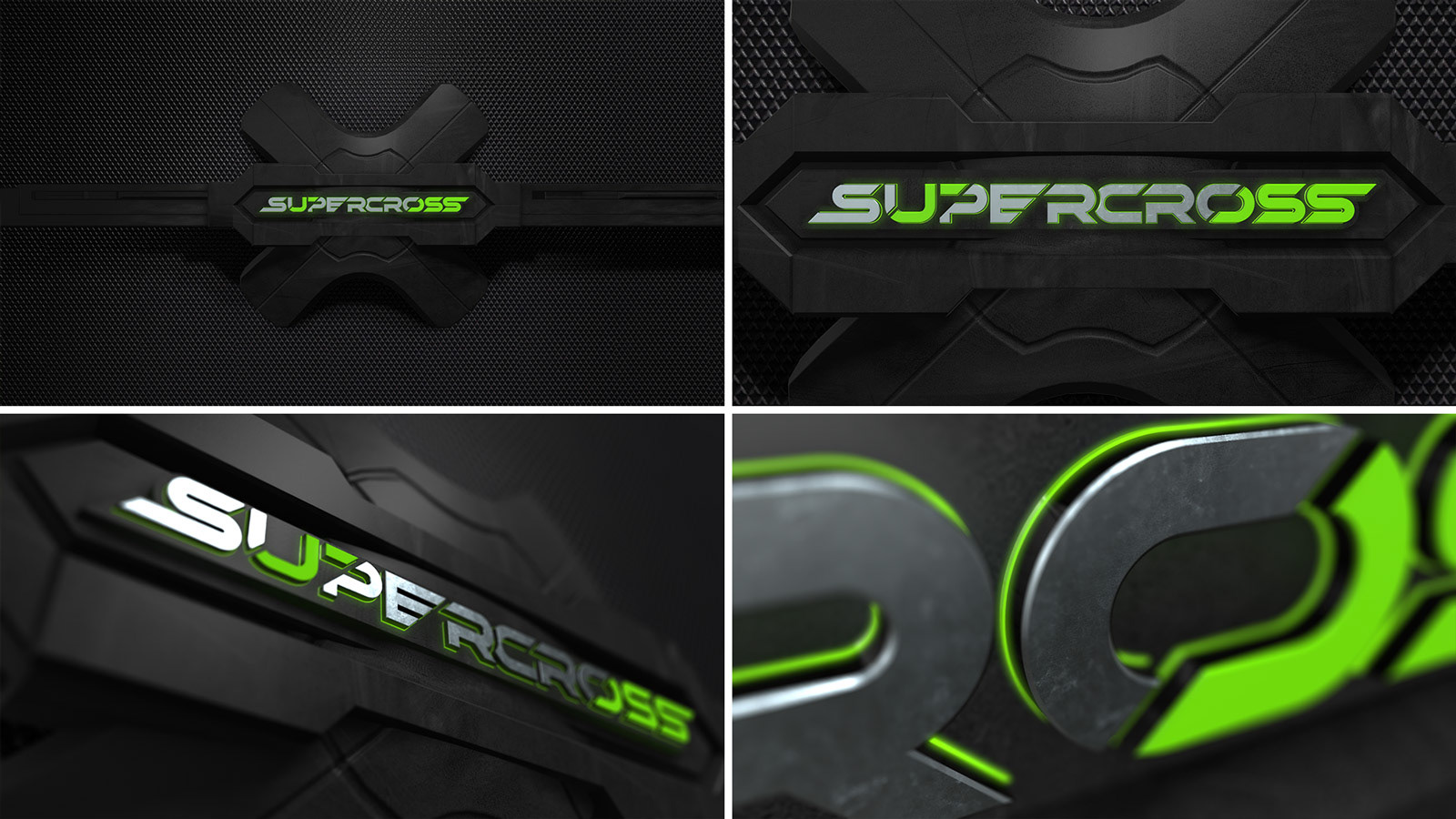
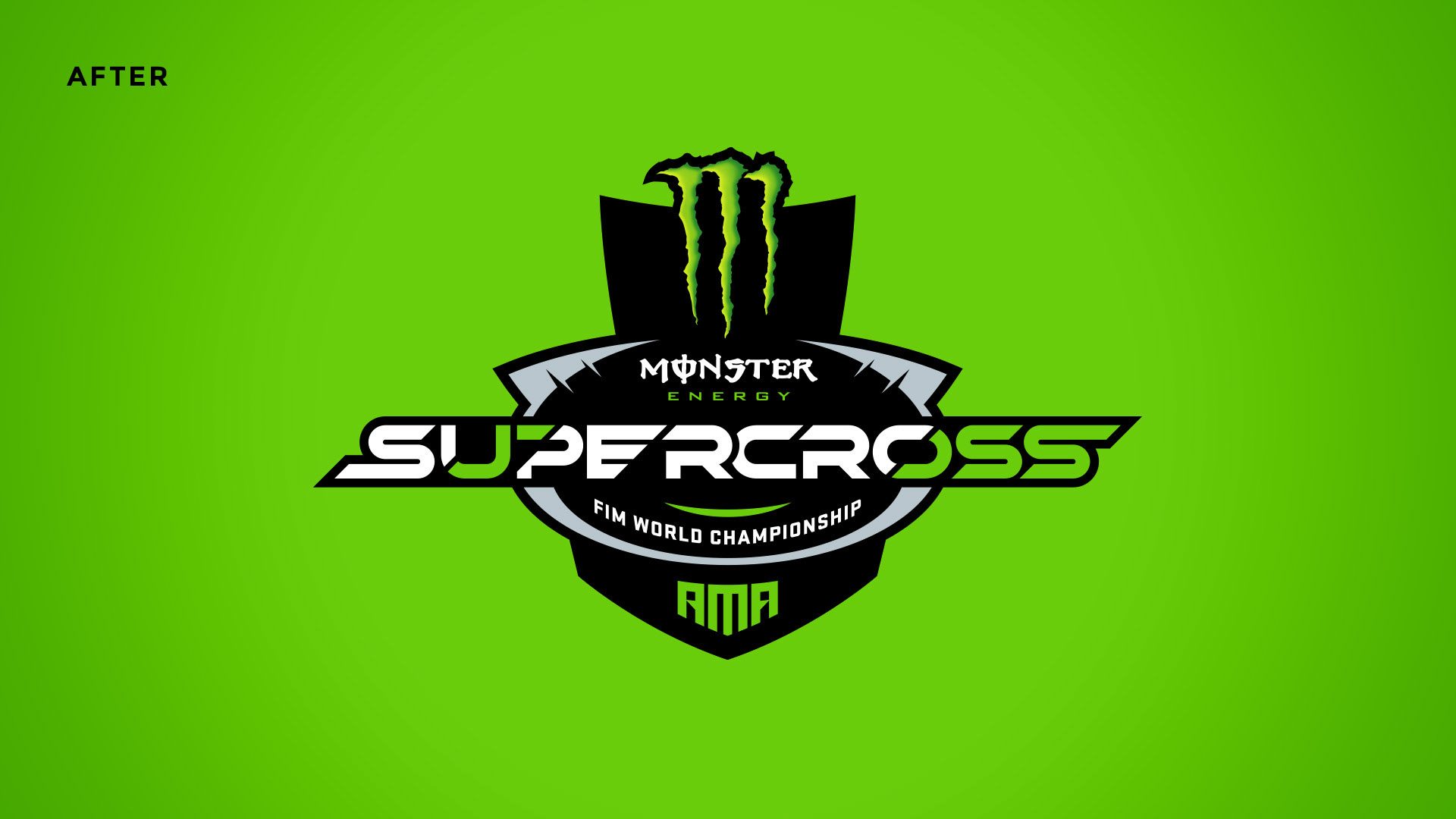
The NEW Supercross
Motocross? More like Mojocross. A bulletproof logotype that can live just about anywhere and keep it's sex appeal.
We developed a strong logotype that can live as a primary, secondary and even tertiary element in an environment of a powerful title sponsorship. It began with a hand-crafted typeface is built for pure performance–rooted in geometry and precision so it can live in any environment at any scale. Along with it, a minimalist monogram mark that shares the same DNA as its wordmark counterpart.